Cartograms are used for visualizing geographically distributed data by scaling the regions of a map (e.g., countries in Europe) such that their areas are proportional to the data associated with them (e.g., GDP). Traditional cartograms are designed to show only a single statistical variable, but in practice, it is often useful to show two variables (e.g., the total sales for two competing companies by region) simultaneously.
We propose a simple yet novel approach of bivariate cartograms, a technique specifically designed to allow for the simultaneous comparison of two geo-statistical variables. Both variables are represented in the visual encoding as areas. We use two complementary colors to show the relation between two variables (whether one is smaller or larger than the other).
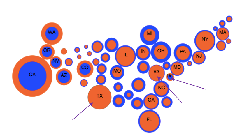
A bivariate cartogram (right) of the US showing the country-wide distribution of Starbucks and McDonald's shops, alongside with a legend (left). The size of the circles is directly proportional to the number of stores, while the thickness of the rings is proportional to the difference between the two variables. The orange circles in the West show a greater number of Starbucks shops, while in the East and Midwest the blue circles show a greater number of McDonald's shops. The difference is the greatest in California (more Starbucks) and in Michigan (more McDonald's), as indicated by the thick rings around CA and MI. Outliers such as DC, and CO stand out
On the contrary, here are some traditional visualization approaches to show the same two datasets. None of these visualizations is as effective as bivariate cartograms in finding geographical patterns and outliers.
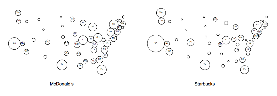
Side-by-side monovariate cartogram
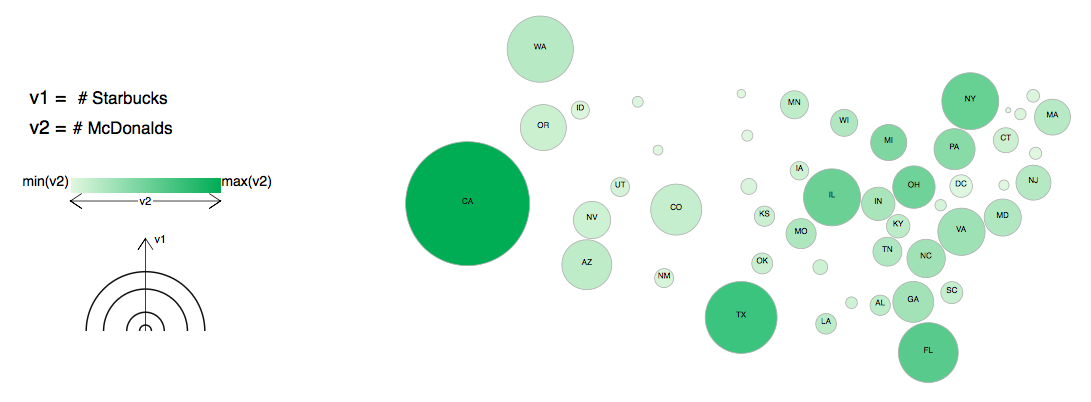
Shaded cartogram
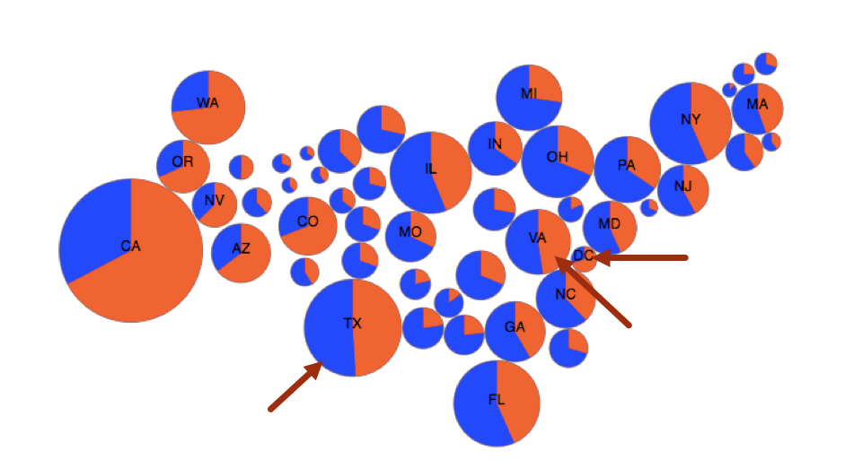
Using pie-chart
Using filled concentric circles
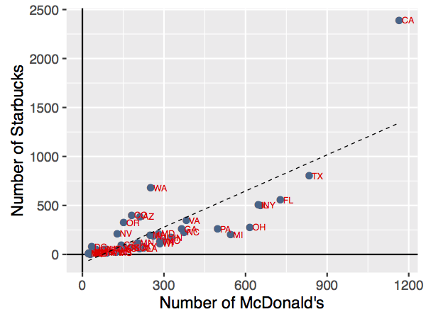
Using scatterplot
For more examples of bivariate cartograms on other datasets, click here
